Monday, October 29, 2018

Building Links with Great Content - Natural Syndication Networks

Posted by KristinTynski

The debate is over and the results are clear: the best way to improve domain authority is to generate large numbers of earned links from high-authority publishers.

Getting these links is not possible via:

  • Link exchanges
  • Buying links
  • Private Blog Networks, or PBNs
  • Comment links
  • Paid native content or sponsored posts
  • Any other method you may have encountered

There is no shortcut. The only way to earn these links is by creating content that is so interesting, relevant, and newsworthy to a publisher’s audience that the publisher will want to write about that content themselves.

Success, then, is predicated on doing three things extremely well:

  1. Developing newsworthy content (typically meaning that content is data-driven)
  2. Understanding who to pitch for the best opportunity at success and natural syndication
  3. Writing and sending pitches effectively

We’ve covered point 1 and point 3 on other Moz posts. Today, we are going to do a deep dive into point 2 and investigate methods for understanding and choosing the best possible places to pitch your content. Specifically, we will reveal the hidden news syndication networks that can mean the difference between generating less than a handful or thousands of links from your data-driven content.

Understanding News Syndication Networks

Not all news publishers are the same. Some publishers behave as hubs, or influencers, generating the stories and content that is then “picked up” and written about by other publishers covering the same or similar beats.

Some of the top hubs should be obvious to anyone: CNN, The New York Times, BBC, or Reuters, for instance. Their size, brand authority, and ability to break news make them go-to sources for the origination of news and some of the most common places journalists and writers from other publications go to for story ideas. If your content gets picked up by any of these sites, it’s almost certain that you will enjoy widespread syndication of your story to nearly everywhere that could be interested without any intervention on your part.

Unfortunately, outside of the biggest players, it’s often unclear which other sites also enjoy “Hub Status,” acting as a source for much of the news writing that happens around any specific topic or beat.

At Fractl, our experience pitching top publishers has given us a deep intuition of which domains are likely to be our best bet for the syndication potential of content we create on behalf of our clients, but we wanted to go a step further and put data to the question. Which publishers really act as the biggest hubs of content distribution?

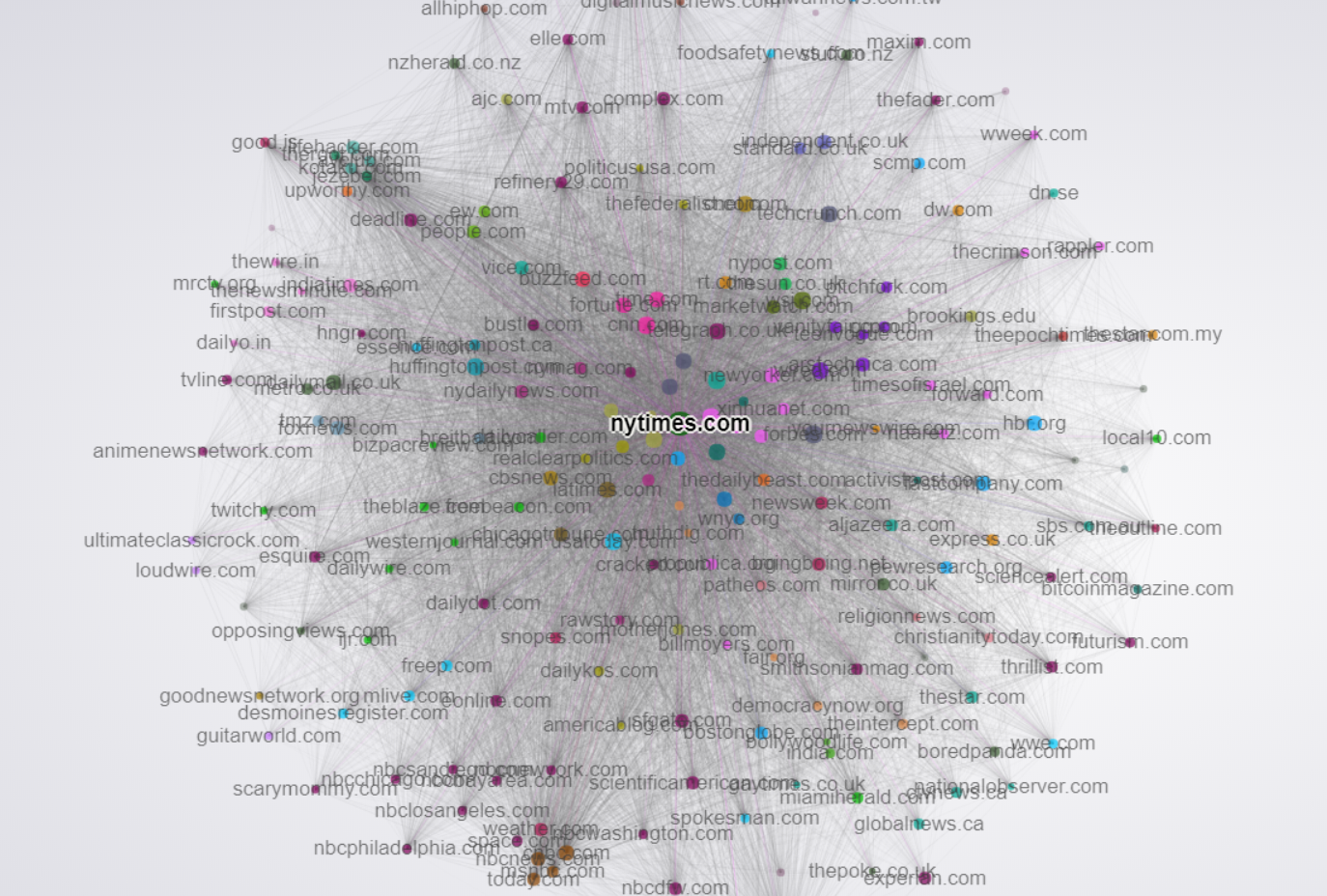
To get a better handle on this question, we took a look at the link networks of the top 400 most trafficked American publishers online. We then utilized Gephi, a powerful network visualization tool to make sense of this massive web of links. Below is a visualization of that network.

An interactive version is available here.

Before explaining further, let’s detail how the visualization works:

  • Each colored circle is called a node. A node represents one publisher/website
  • Node size is related to Domain Authority. The larger the node, the more domain authority it has.
  • The lines between the nodes are called edges, and represent the links between each publisher.
  • The strength of the edges/links corresponds to the total number of links from one publisher to another. The more links from one publisher to another, the stronger the edge, and the more “pull” exerted between those two nodes toward each other.
  • You can think of the visualization almost like an epic game of tug of war, where nodes with similar link networks end up clustering near each other.
  • The colors of the nodes are determined by a “Modularity” algorithm that looks at the overall similarity of link networks, comparing all nodes to each other. Nodes with the same color exhibit the most similarity. The modularity algorithm implemented in Gephi looks for the nodes that are more densely connected together than to the rest of the network

Once visualized, important takeaways that can be realized include the following:

  1. The most “central” nodes, or the ones appearing near the center of the graph, are the ones that enjoy links from the widest variety of sites. Naturally, the big boys like Reuters, CNN and the NYTimes are located at the center, with large volumes of links incoming from all over.
  2. Tight clusters are publishers that link to each other very often, which creates a strong attractive force and keeps them close together. Publishers like these are often either owned by the same parent company or have built-in automatic link syndication relationships. A good example is the Gawker Network (at the 10PM position). The closeness of nodes in this network is the result of heavy interlinking and story syndication, along with the effects of site-wide links shared between them. A similar cluster appears at the 7PM position with the major NBC-owned publishers (NBC.com, MSNBC.com, Today.com, etc.). Nearby, we also see large NBC-owned regional publishers, indicating heavy story syndication also to these regional owned properties.
  3. Non-obvious similarities between the publishers can also be gleaned. For instance, notice how FoxNews.com and TMZ.com are very closely grouped, sharing very similar link profiles and also linking to each other extensively. Another interesting cluster to note is the Buzzfeed/Vice cluster. Notice their centrality lies somewhere between serious news and lifestyle, with linkages extending out into both.
  4. Sites that cover similar themes/beats are often located close to each other in the visualization. We can see top-tier lifestyle publishers clustered around the 1PM position. News publishers clustered near other news publishers with similar political leanings. Notice the closeness of Politico, Salon, The Atlantic, and The Washington Post. Similarly, notice the proximity of Breitbart, The Daily Caller, and BizPacReview. These relationships hint at hidden biases and relationships in how these publishers pick up each other’s stories.

A More Global Perspective

Last year, a fascinating project by Kalev Leetaru at Forbes looked at the dynamics Google News publishers in the US and around the world. The project leveraged GDelt’s massive news article dataset, and visualized the network with Gephi, similarly to the above network discussed in the previous paragraph.

This visualization differs in that the link network was built looking only at in-context links, whereas the visualization featured in the previous paragraph looked at all links. This is perhaps an even more accurate view of news syndication networks because it better parses out site-wide links, navigation links, and other non-context links that impact the graph. Additionally, this graph was generated using more than 121 million articles from nearly every country in the world, containing almost three-quarters of a billion individual links. It represents one of the most accurate pictures of the dynamics of the global news landscape ever assembled.

Edge weights were determined by the total number of links from each node to each other node. The more links, the stronger the edge. Node sizes were calculated using Pagerank in this case instead of Domain Authority, though they are similar metrics.

Using this visualization, Mr. Leetaru was able to infer some incredibly interesting and potentially powerful relationships that have implications for anyone who pitches mainstream publishers. Some of the most important include:

  1. In the center of the graph, we see a very large cluster. This cluster can be thought of as essentially the “Global Media Core,” as Mr. Leetaru puts it. Green nodes represent American outlets. This, as with the previous example, shows the frequency with which these primary news outlets interlink and cover each other’s stories, as well as how much less frequently they cite sources from smaller publications or local and regional outlets.
  2. Interestingly, CNN seems to play a unique role in the dissemination to local and regional news. Note the many links from CNN to the blue cluster on the far right. Mr. Leetaru speculates this could be the result of other major outlets like the NYTimes and the Washington Post using paywalls. This point is important for anyone who pitches content. Paywalls should be something taken into consideration, as they could potentially significantly reduce syndication elsewhere.
  3. The NPR cluster is another fascinating one, suggesting that there is heavy interlinking between NPR-related stories and also between NPR and the Washington Post and NYTimes. Getting a pickup on NPR’s main site could result in syndication to many of its affiliates. NYTimes or Washington Post pickups could also have a similar effect due to this interlinking.
  4. For those looking for international syndication, there are some other interesting standouts. Sites like NYYibada.com cover news in the US. They are involved with Chinese language publications, but also have versions in other languages, including English. Sites like this might not seem to be good pitch targets, but could likely be pitched successfully given their coverage of many of the same stories as US-based English language publications.
  5. The blue and pink clusters at the bottom of the graph are outlets from the Russian and Ukrainian press, respectively. You will notice that while the vast majority of their linking is self-contained, there seem to be three bridges to international press, specifically via the BBC, Reuters, and AP. This suggests getting pickups at these outlets could result in much broader international syndication, at least in Eastern Europe and Russia.
  6. Additionally, the overall lack of deep interlinking between publications of different languages suggests that it is quite difficult to get English stories picked up internationally.
  7. Sites like ZDnet.com have foreign language counterparts, and often translate their stories for their international properties. Sites like these offer unique opportunities for link syndication into mostly isolated islands of foreign publications that would be difficult to reach otherwise.

I would encourage readers to explore this interactive more. Isolating individual publications can give deep insight into what syndication potential might be possible for any story covered. Of course, many factors impact how a story spreads through these networks. As a general rule, the broader the syndication network, the more opportunities that exist.

Link Syndication in Practice

Over our 6 years in business, Fractl has executed more than 1,500 content marketing campaigns, promoted using high-touch, one-to-one outreach to major publications. Below are two views of content syndication we have seen as a result of our content production and promotion work.

Let’s first look just at a single campaign.

Recently, Fractl scored a big win for our client Signs.com with our “Branded in Memory” campaign, which was a fun and visual look at how well people remember brand logos. We had the crowd attempt to recreate well-known brand logos from memory, and completed data analysis to understand more deeply which brands seem to have the best overall recall.

As a result of strategic pitching, the high public appeal, and the overall "coolness" factor of the project, it was picked up widely by many mainstream publications, and enjoyed extensive syndication.

Here is what that syndication looked like in network graph form over time:

If you are interested in seeing and exploring the full graph, you can access the interactive by clicking on the gif above, or clicking here. As with previous examples, node size is related to domain authority.

A few important things to note:

  • The orange cluster of nodes surrounding the central node are links directly to the landing page on Signs.com.
  • Several pickups resulted in nodes (publications) that themselves generated many numbers of links pointing at the story they wrote about the Signs.com project. The blue cluster at the 8PM position is a great example. In this case it was a pickup from BoredPanda.com.
  • Nodes that do not link to Signs.com are secondary syndications. They pass link value through the node that links to Signs.com, and represent an opportunity for link reclamation. Fractl follows up on all of these opportunities in an attempt to turn these secondary syndications into do-follow links pointing directly at our client’s domain.
  • An animated view gives an interesting insight into the pace of link accumulation both to the primary story on Signs.com, but also to the nodes that garnered their own secondary syndications. The GIF represents a full year of pickups. As we found in my previous Moz post examining link acquisition over time, roughly 50% of the links were acquired in the first month, and the other 50% over the next 11 months.

Now, let’s take a look at what syndication networks look like when aggregated across roughly 3 months worth of Fractl client campaigns (not fully comprehensive):

If you are interested in exploring this in more depth, click here or the above image for the interactive. As with previous examples, node size is related to domain authority.

A few important things to note:

  1. The brown cluster near the center labeled “placements” are links pointing back directly to the landing pages on our clients’ sites. Many/most of these links were the result of pitches to writers and editors at those publications, and not as a result of natural syndication.
  2. We can see many major hubs with their own attached orbits of linking nodes. At 9PM, we see entrepreneur.com, at 12PM we see CNBC.com, 10PM we see USAToday, etc.
  3. Publications with large numbers of linking nodes surrounding them are examples of prime pitching targets, given how syndications link back to stories on those publications appear in this aggregate view.

Putting it All Together

New data tools are enabling the ability to more deeply understand how the universe of news publications and the larger "blogosphere" operate dynamically. Network visualization tools in particular can be put to use to yield otherwise impossible insights about the relationships between publications and how content is distributed and syndicated through these networks.

The best part is that creating visualizations with your own data is very straightforward. For instance, the link graphs of Fractl content examples, along with the first overarching view of news networks, was built using backlink exports from SEMrush. Additionally, third party resources such as Gdelt offer tools and datasets that are virtually unexplored, providing opportunity for deep understanding that can convey significant advantages for those looking to optimize their content promotion and syndication process.


Sign up for The Moz Top 10, a semimonthly mailer updating you on the top ten hottest pieces of SEO news, tips, and rad links uncovered by the Moz team. Think of it as your exclusive digest of stuff you don't have time to hunt down but want to read!


Source: Moz Blog

Friday, October 26, 2018

Log File Analysis 101 - Whiteboard Friday

Posted by BritneyMuller

Log file analysis can provide some of the most detailed insights about what Googlebot is doing on your site, but it can be an intimidating subject. In this week's Whiteboard Friday, Britney Muller breaks down log file analysis to make it a little more accessible to SEOs everywhere.

Click on the whiteboard image above to open a high-resolution version in a new tab!

Video Transcription

Hey, Moz fans. Welcome to another edition of Whiteboard Friday. Today we're going over all things log file analysis, which is so incredibly important because it really tells you the ins and outs of what Googlebot is doing on your sites.

So I'm going to walk you through the three primary areas, the first being the types of logs that you might see from a particular site, what that looks like, what that information means. The second being how to analyze that data and how to get insights, and then the third being how to use that to optimize your pages and your site.

For a primer on what log file analysis is and its application in SEO, check out our article: How to Use Server Log Analysis for Technical SEO

1. Types

So let's get right into it. There are three primary types of logs, the primary one being Apache. But you'll also see W3C, elastic load balancing, which you might see a lot with things like Kibana. But you also will likely come across some custom log files. So for those larger sites, that's not uncommon. I know Moz has a custom log file system. Fastly is a custom type setup. So just be aware that those are out there.

Log data

So what are you going to see in these logs? The data that comes in is primarily in these colored ones here.

So you will hopefully for sure see:

  • the request server IP;
  • the timestamp, meaning the date and time that this request was made;
  • the URL requested, so what page are they visiting;
  • the HTTP status code, was it a 200, did it resolve, was it a 301 redirect;
  • the user agent, and so for us SEOs we're just looking at those user agents' Googlebot.

So log files traditionally house all data, all visits from individuals and traffic, but we want to analyze the Googlebot traffic. Method (Get/Post), and then time taken, client IP, and the referrer are sometimes included. So what this looks like, it's kind of like glibbery gloop.

It's a word I just made up, and it just looks like that. It's just like bleh. What is that? It looks crazy. It's a new language. But essentially you'll likely see that IP, so that red IP address, that timestamp, which will commonly look like that, that method (get/post), which I don't completely understand or necessarily need to use in some of the analysis, but it's good to be aware of all these things, the URL requested, that status code, all of these things here.

2. Analyzing

So what are you going to do with that data? How do we use it? So there's a number of tools that are really great for doing some of the heavy lifting for you. Screaming Frog Log File Analyzer is great. I've used it a lot. I really, really like it. But you have to have your log files in a specific type of format for them to use it.

Splunk is also a great resource. Sumo Logic and I know there's a bunch of others. If you're working with really large sites, like I have in the past, you're going to run into problems here because it's not going to be in a common log file. So what you can do is to manually do some of this yourself, which I know sounds a little bit crazy.

Manual Excel analysis

But hang in there. Trust me, it's fun and super interesting. So what I've done in the past is I will import a CSV log file into Excel, and I will use the Text Import Wizard and you can basically delineate what the separators are for this craziness. So whether it be a space or a comma or a quote, you can sort of break those up so that each of those live within their own columns. I wouldn't worry about having extra blank columns, but you can separate those. From there, what you would do is just create pivot tables. So I can link to a resource on how you can easily do that.

Top pages

But essentially what you can look at in Excel is: Okay, what are the top pages that Googlebot hits by frequency? What are those top pages by the number of times it's requested?

Top folders

You can also look at the top folder requests, which is really interesting and really important. On top of that, you can also look into: What are the most common Googlebot types that are hitting your site? Is it Googlebot mobile? Is it Googlebot images? Are they hitting the correct resources? Super important. You can also do a pivot table with status codes and look at that. I like to apply some of these purple things to the top pages and top folders reports. So now you're getting some insights into: Okay, how did some of these top pages resolve? What are the top folders looking like?

You can also do that for Googlebot IPs. This is the best hack I have found with log file analysis. I will create a pivot table just with Googlebot IPs, this right here. So I will usually get, sometimes it's a bunch of them, but I'll get all the unique ones, and I can go to terminal on your computer, on most standard computers.

I tried to draw it. It looks like that. But all you do is you type in "host" and then you put in that IP address. You can do it on your terminal with this IP address, and you will see it resolve as a Google.com. That verifies that it's indeed a Googlebot and not some other crawler spoofing Google. So that's something that these tools tend to automatically take care of, but there are ways to do it manually too, which is just good to be aware of.

3. Optimize pages and crawl budget

All right, so how do you optimize for this data and really start to enhance your crawl budget? When I say "crawl budget," it primarily is just meaning the number of times that Googlebot is coming to your site and the number of pages that they typically crawl. So what is that with? What does that crawl budget look like, and how can you make it more efficient?

  • Server error awareness: So server error awareness is a really important one. It's good to keep an eye on an increase in 500 errors on some of your pages.
  • 404s: Valid? Referrer?: Another thing to take a look at is all the 400s that Googlebot is finding. It's so important to see: Okay, is that 400 request, is it a valid 400? Does that page not exist? Or is it a page that should exist and no longer does, but you could maybe fix? If there is an error there or if it shouldn't be there, what is the referrer? How is Googlebot finding that, and how can you start to clean some of those things up?
  • Isolate 301s and fix frequently hit 301 chains: 301s, so a lot of questions about 301s in these log files. The best trick that I've sort of discovered, and I know other people have discovered, is to isolate and fix the most frequently hit 301 chains. So you can do that in a pivot table. It's actually a lot easier to do this when you have kind of paired it up with crawl data, because now you have some more insights into that chain. What you can do is you can look at the most frequently hit 301s and see: Are there any easy, quick fixes for that chain? Is there something you can remove and quickly resolve to just be like a one hop or a two hop?
  • Mobile first: You can keep an eye on mobile first. If your site has gone mobile first, you can dig into that, into the logs and evaluate what that looks like. Interestingly, the Googlebot is still going to look like this compatible Googlebot 2.0. However, it's going to have all of the mobile implications in the parentheses before it. So I'm sure these tools can automatically know that. But if you're doing some of the stuff manually, it's good to be aware of what that looks like.
  • Missed content: So what's really important is to take a look at: What's Googlebot finding and crawling, and what are they just completely missing? So the easiest way to do that is to cross-compare with your site map. It's a really great way to take a look at what might be missed and why and how can you maybe reprioritize that data in the site map or integrate it into navigation if at all possible.
  • Compare frequency of hits to traffic: This was an awesome tip I got on Twitter, and I can't remember who said it. They said compare frequency of Googlebot hits to traffic. I thought that was brilliant, because one, not only do you see a potential correlation, but you can also see where you might want to increase crawl traffic or crawls on a specific, high-traffic page. Really interesting to kind of take a look at that.
  • URL parameters: Take a look at if Googlebot is hitting any URLs with the parameter strings. You don't want that. It's typically just duplicate content or something that can be assigned in Google Search Console with the parameter section. So any e-commerce out there, definitely check that out and kind of get that all straightened out.
  • Evaluate days, weeks, months: You can evaluate days, weeks, and months that it's hit. So is there a spike every Wednesday? Is there a spike every month? It's kind of interesting to know, not totally critical.
  • Evaluate speed and external resources: You can evaluate the speed of the requests and if there's any external resources that can potentially be cleaned up and speed up the crawling process a bit.
  • Optimize navigation and internal links: You also want to optimize that navigation, like I said earlier, and use that meta no index.
  • Meta noindex and robots.txt disallow: So if there are things that you don't want in the index and if there are things that you don't want to be crawled from your robots.txt, you can add all those things and start to help some of this stuff out as well.

Reevaluate

Lastly, it's really helpful to connect the crawl data with some of this data. So if you're using something like Screaming Frog or DeepCrawl, they allow these integrations with different server log files, and it gives you more insight. From there, you just want to reevaluate. So you want to kind of continue this cycle over and over again.

You want to look at what's going on, have some of your efforts worked, is it being cleaned up, and go from there. So I hope this helps. I know it was a lot, but I want it to be sort of a broad overview of log file analysis. I look forward to all of your questions and comments below. I will see you again soon on another Whiteboard Friday. Thanks.

Video transcription by Speechpad.com


Sign up for The Moz Top 10, a semimonthly mailer updating you on the top ten hottest pieces of SEO news, tips, and rad links uncovered by the Moz team. Think of it as your exclusive digest of stuff you don't have time to hunt down but want to read!


Source: Moz Blog

Thursday, October 25, 2018

What to Do When Someone Steals Your Blog Content

The post What to Do When Someone Steals Your Blog Content appeared first on ProBlogger.

What to do when someone steals your blog content

This post is based on Episode 108 of the ProBlogger podcast.

One day, you come across someone else’s blog online that has surprisingly familiar content.

Very familiar content. Yours, in fact!

In most cases, they’ll have taken entire posts for your blog – images, links and all – by “scraping” your blog’s RSS feed.

Occasionally, it might be a little different. Perhaps someone has copied your whole post onto their brand-new blog because they really don’t know any better. They may even think they’re doing you a favour.

Whatever the exact situation, though, it’s never pleasant to realise that someone has effectively stolen your hard work. It’s even worse if they’re passing it off as their own.

So, you’re probably wanting to know what to do when someone steals your blog content.

In this post, I’ll be outlining the steps you can take to get that content taken down from their website – but first, it’s worth considering whether you want to take any action at all.

Should You Bother Fighting Content Thieves at All?

Let’s be clear: I know you’ll probably feel angry to find that someone is ripping off your content. But if their site doesn’t rank at all highly in Google and is covered in ads … chances are, no-one’s reading it anyway.

Years ago, I all but gave up chasing down sites that steal my content. There are so many that I could spend a couple of hours every single day just dealing with it. I decided, instead, I’d rather spend my time creating more content that serves my readers.

Before that, I’d tried to tackle the problem because, back then, bloggers felt that Google would penalise sites with duplicate content. So if someone else copied my post onto their site, I worried that I would be the one penalised.

Since then, Google has become increasingly smart about working out who’s the original source of the content.

If you find that a piece of your content has been used without your permission:

  1. Google a sentence or two (in quotation marks) from your post.
  2. See which site ranks more highly: yours, or theirs.

If your site is ranking more highly … it’s not worth your time doing anything at all. If their site ranks more highly than yours, though, it’s probably worth taking action.

How to Reduce the Impact of Content Scraping

“Scraping” is when someone steals your blog content directly from your RSS feed. They’re probably using some sort of tool to automate their theft, so in almost every case, they’ll simply publish your post exactly as it appeared on your blog … including all the links in it.

That means that it’s a great idea to:

  • Include at least one link in each post to another post on your blog. Hopefully you’re already doing this, as it’s a great way to encourage readers to stick around for longer! If readers come across the stolen content, they may well follow these links back to your blog.
  • Use a tool like the Yoast SEO plugin to include a link to your blog, and to the original blog post, in the footer of your RSS feed. If someone is scraping your RSS feed, they’ll probably publish that footer too. You can put in any text you want – e.g. “This article was originally published at….” or “The original source of this article is…” which can help clue Google in about which version of the content to prioritise in searches! (And if you’re not already using Yoast, I strongly recommend it for its many other SEO benefits too.)

When You Probably Will Want to Take Action … and How to Do So

While most content theft is the automated type I’ve described above, some is different.

I will take action if people use my content without acknowledging the source. They might strip out any links to my sites, and they might even publish it under their own name.

This only happens rarely, in my experience – but every year or so, I find someone doing this. Sometimes it’s just with one post, but often, it’s with a whole bunch of posts.

I’ve come across a number of bloggers who’ve taken over a hundred posts from ProBlogger or Digital Photography School, put their own names and images into those posts, maybe rewritten the first couple of paragraphs, and published it as their own.

This does make me angry! I put a lot of time into the content, or if it’s been created by a paid writer for dPS, they’ve put a lot of time in (and I’ve paid for it)!

I have a process I follow to take action – rather than just calling them out on Twitter straight away, which is always a bit of a temptation.

Step #1: Contact the Site That’s Taken Your Content

The first port of call should always be to contact the blogger in question. This can be tricky, as there may not be any contact details on their site. If you can get in touch with them, though, tell them clearly that they’re violating your copyright.

At this stage, you’ll probably want to be polite (if not exactly warm and friendly). It’s worth giving people the benefit of the doubt. More often than not, they’ll know exactly what they’re doing and why it’s wrong, but sometimes they may be genuinely clueless, or they’ve been duped themselves.

In one case, for instance, a blogger had hired someone to write content – and that person had ripped them off by stealing a whole heap of content from my site, and also from other bloggers’ sites.

I normally ask people to remove the content within 24 hours. If they’ve done something really bad (e.g. they’ve stolen a lot of content to pass off as their own), I’d also ask them to issue a public apology.

Step #2: Contact the Host of the Site That’s Taken Your Content

If you can’t get a response from the blogger, the next step is to contact their webhost. You can normally track down the site’s host through whois.net: type in the URL of the site and you’ll see a list of details. Look at the “name server” to see where the site is hosted.

(This can also be a way to get contact details for the blogger, if you can’t find those on their site.)

Hosting companies can get into serious legal trouble if they host a site that is violating copyright laws, so it’s in their interests to quickly take down any stolen content.

Many hosts have a process you can follow to issue them with a Digital Millennium Copyright Act (DMCA) takedown notice against the site in question.

The DMCA notice is a legal document that you’ll need to sign (so do make sure the blog really has stolen your content before issuing it – don’t take someone else’s word for it, but check into the facts yourself).

You can issue the DMCA notice to the blogger or directly to their webhost. Most hosts will take down copyrighted content very quickly after receiving a DMCA notice.

If the blog is on Blogger, Tumblr, Medium, or any other large blogging platform, look in the Terms and Conditions or the Frequently Asked Questions to find out how to issue the DMCA notice.

So that the host can investigate, you’ll need to provide:

  • A link to where your content was originally published online.
  • Information about when you published it.

I’ve only had to go as far as issuing a DMCA notice five or six times in ten years, so hopefully you won’t need to get to this stage.

If you’re in contact with the blogger, simply telling them “my next step is to issue a DMCA takedown notice” will often be enough to prompt them to take swift action.

Step #3: Bring More Pressure Onto the Blogger

If you can’t issue the DMCA notice, or if the process ends up delayed, you might decide you want to go further.

A couple of ways to do this are to:

Contact the Blogger’s Advertisers

If the site has ads all over it (and most of the sites that steal content do!), then contact their advertisers and explain that their ads are on a site that’s stolen your work. The advertisers may will withdraw, or threaten to withdraw, their ads – and you may well find that a blogger who had no ethical qualms about stealing your content will suddenly take it down when their money is on the line.

Publicly Shame the Blogger

I’ve  done this a few times – sometimes, perhaps, a bit earlier than I should have! I’m lucky enough to have a fairly large social profile, so my readers’ outrage probably helped a little. Even if you don’t have a large Twitter following or Facebook page, though, calling out a blogger on social media can prompt them to take swift action.

Hopefully, by this point, you’ve succeeded in getting your content taken down. If not, you have a couple of more drastic options:

  • Filing to get the site banned from Google and other search engines, under the Digital Millennium Copyright Act (DMCA).
  • Taking legal action. This can be a very expensive route to go down, so it’s definitely best viewed as a last resort.

In most cases, though, I’ve found that I don’t need to go beyond step one – sending the blogger an email. They’ll probably make some kind of excuse (I’ve never had anyone actually admit to knowingly stealing my content) – but they most likely will take that content down.

With any case of contact theft, it’s worth asking yourself: do I want to spend my time fighting this, or can I use my time in a more constructive way?

Only you can answer that – you’ll want to consider things like whether the site is outranking yours, and whether they at least link back to you as the source.

If you do decide to take action, I hope the steps above help you. Feel free to share your own experience, tips and suggestions in the comments.


Image credit: Markus Spiske

The post What to Do When Someone Steals Your Blog Content appeared first on ProBlogger.


Source: ProBlogger

Wednesday, October 24, 2018

Can You Still Use Infographics to Build Links?

Posted by DarrenKingman

Content link building: Are infographics still the highest ROI format?

Fun fact: the first article to appear online proclaiming that "infographics are dead" appeared in 2011. Yet, here we are.

For those of you looking for a quick answer to this strategy-defining question, infographics aren’t as popular as they were between 2014 and 2015. Although they were the best format for generating links, popular publications aren’t using them as often as they used to, as evidenced in this research. However, they are still being used daily and gaining amazing placements and links for their creators — and the data shows, they are already more popular in 2018 than they were in 2013.

However, if there’s one format you want to be working with, use surveys.

Note: I am at the mercy of the publication I’ve reviewed as to what constitutes their definition of an infographic in order to get this data at scale. However, throughout my research, this would typically include a relatively long text- and data-heavy visualization of a specific topic.

The truth is that infographics are still one of the most-used formats for building links and brand awareness, and from my outreach experiences, with good reason. Good static visuals or illustrations (as we now call them to avoid the industry-self-inflicted shame) are often rich in content with engaging visuals that are extremely easy for journalists to write about and embed, something to which anyone who’s tried sending an iframe to a journalist will attest.

That’s why infographics have been going strong for over a decade, and will continue to for years to come.

My methodology

Prophecies aside, I wanted to take a look into the data and discover whether or not infographics are a dying art and if journalists are still posting them as often as they used to. I believe the best way to determine this is by taking a look at what journalists are publishing and mapping that over time.

Not only did I look at how often infographics are being used, but I also measured them against other content formats typically used for building links and brand awareness. If infographics are no longer the best format for content-based link building, I wanted to find out what was. I’ve often used interactives, surveys, and photographic content, like most people producing story-driven creatives, so I focused on those as my formats for comparison.

Internally, you can learn a ton by cross-referencing this sort of data (or data from any key publication clients or stakeholders have tasked you with) with your own data highlighting where you're seeing most of your successes and identifying which formats and topics are your strengths or weaknesses. You can quickly then measure up against those key target publications and know if your strongest format/topic is one they favor most, or if you might need to rethink a particular process to get featured.

I chose to take a look at Entrepreneur.com as a base for this study, so anyone working with B2B or B2C content, whether in-house or agency-side, will probably get the most use out of this (especially because I scraped the names of journalists publishing this content — shh! DM me for it. Feels a little wrong to publish that openly!).

Disclaimer: There were two methods of retrieving this data that I worked through, each with their own limitations. After speaking with fellow digital PR expert, Danny Lynch, I settled on using Screaming Frog and custom extraction using XPath. Therefore, I am limited to what the crawl could find, which still included over 70,000 article URLs, but any orphaned or removed pages wouldn’t be possible to crawl and aren’t included.

The research

Here's how many infographics have been featured as part of an article on Entrepreneur.com over the years:

As we’ve not yet finished 2018 (3 months to go at the time this data was pulled), we can estimate the final usage will be in the 380 region, putting it not far from the totals of 2017 and 2016. Impressive stuff in comparison to years gone by.

However, there's a key unknown here. Is the post-2014/15 drop-off due to lack of outreach? Is it a case of content creators simply deciding infographics were no longer the preferred format to cover topics and build links for clients, as they were a few years ago?

Both my past experiences agency-side and my gut feeling would be that content creators are moving away from it as a core format for link building. Not only would this directly impact the frequency they are published, but it would also impact the investment creators place in producing infographics, and in an environment where infographics need to improve to survive, that would only lead to less features.

Another important data point I wanted to look at was the amount of content being published overall. Without this info, there would be no way of knowing if, with content quality improving all the time, journalists were spending a significantly more time on posts than they had previously while publishing at diminishing rates. To this end, I looked at how much content Entrepreneur.com published each year over the same timeframe:

Although the data shows some differences, the graphs are pretty similar. However, it gets really interesting when we divide the number of infographics by the number of articles in total to find out how many infographics exist per article:

There we have it. The golden years of infographics were certainly 2013 and 2014, but they've been riding a wave of consistency since 2015, comprising a higher percentage of overall articles that link builders would have only dreamed of in 2012, when they were way more in fashion.

In fact, by breaking down the number of infographics vs overall content published, there’s a 105% increase in the number of articles that have featured an infographic in 2018 compared to 2012.

Infographics compared to other creative formats

With all this in mind, I still wanted to uncover the fascination with moving away from infographics as a medium of creative storytelling and link building. Is it an obsession with building and using new formats because we’re bored, or is it because other formats provide a better link building ROI?

The next question I wanted to answer was: “How are other content types performing and how do they compare?” Here’s the answer:

Again, using figures publisher-side, we can see that the number of posts that feature infographics is consistently higher than the number of features for interactives and photographic content. Surveys have more recently taken the mantle, but all content types have taken a dip since 2015. However, there’s no clear signal there that we should be moving away from infographics just yet.

In fact, when pitting infographics against all of the other content types (comparing the total number of features), apart from 2013 and 2014 when infographics wiped the floor with everything, there’s no signal to suggest that we need to ditch them:

Year

Infographics vs Interactives

Infographics vs Photography

Infographics vs Surveys

2011

-75%

-67%

-90%

2012

-14%

-14%

-65%

2013

251%

376%

51%

2014

367%

377%

47%

2015

256%

196%

1%

2016

186%

133%

-40%

2017

195%

226%

-31%

2018

180%

160%

-42%

This is pretty surprising stuff in an age where we’re obsessed with interactives and "hero" pieces for link building campaigns.

Surveys are perhaps the surprise package here, having seen the same rise that infographics had through 2012 and 2013, now out-performing all other content types consistently over the last two years.

When I cross-reference to find the number of surveys being used per article, we can see that in every year since 2013 their usage has been increasingly steadily. In 2018, they're being used more often per article than infographics were, even in their prime:

Surveys are one of the "smaller" creative campaigns I’ve offered in my career. It's a format I’m gravitating more towards because of their speed and potential for headlines. Critically, they're also cheaper to produce, both in terms of research and production, allowing me to not only create more of them per campaign, but also target news-jacking topics and build links more quickly compared to other production-heavy pieces.

I think, conclusively, this data shows that for a solid ROI when links are the metric, infographics are still competitive and viable. Surveys will serve you best, but be careful if you’re using the majority of your budget on an interactive or photographic piece. Although the rewards can still be there, it’s a risk.

The link building potential of our link building

For one last dive into the numbers, I wanted to see how different content formats perform for publishers, which could provide powerful insight when deciding which type of content to produce. Although we have no way of knowing when we do our outreach which KPIs different journalists are working towards, if we know the formats that perform best for them (even if they don’t know it), we can help their content perform by proxy — which also serves the performance of our content by funneling increased equity.

Unfortunately, I wasn’t able to extract a comment count or number of social shares per post, which I thought would be an interesting insight to review engagement, so I focused on linking root domains to discover if there is any difference in a publisher's ability to build links based on the formats they cover, and if that could lead to an increase in link equity coming our way.

Here’s the average number of links from different domains for each post featuring a different content type received:

Impressively, infographics and surveys continue to hold up really well. Not only are they the content types that the publisher features more often, they are also the content types that build them the most links.

Using these formats to pitch with not only increases the chances that a publisher's post will rank more competitively in your content's topic area (and put your brand at the center of the conversation), it’s also important for your link building activity because it highlights the potential link equity flowing to your features and, therefore, how much ends up on your domain.

This gives you the potential to rank (directly and indirectly) for a variety of phrases centered around your topic. It also gives your domain/target page and topically associated pages a better chance of ranking themselves — at least where links play their part in the algorithm.

Ultimately, and to echo what I mentioned in my intro-summary, surveys have become the best format for building links. I’d love to know how many are pitched, but the fact they generate the most links for our linkers is huge, and if you are doing content-based link building with SEO-centric KPIs, they give you the best shot at maximizing equity and therefore ranking potential.

Infographics certainly still seem to have a huge part in the conversation. Only move away from them if there’s proof in your data. Otherwise, you could be missing out for no reason.

That’s me, guys. I really hope this data and process is interesting for everyone, and I’d love to hear if you’ve found or had experiences that lead to different conclusions.


Sign up for The Moz Top 10, a semimonthly mailer updating you on the top ten hottest pieces of SEO news, tips, and rad links uncovered by the Moz team. Think of it as your exclusive digest of stuff you don't have time to hunt down but want to read!


Source: Moz Blog

Tuesday, October 23, 2018

The Ultimate Cheat Sheet for Taking Full Control of Your Google Knowledge Panels

Posted by MiriamEllis

They say you can’t squeeze blood out of a turnip, but when the turnip (and your biggest potential competitor) is Google, the lifeblood of the local business locations you market could depend on knowing where to take control.

As Google acts to confine ever-more stages of the local consumer journey within their own interface, local enterprises need to assume as much control as possible over the aspects of the Google Knowledge Panel that they can directly or indirectly influence.

This cheat sheet is your fast track to squeezing the most you can out of what Google is still offering.

How Google changed from local business benefactor to competitor

It may not come naturally, at first, to think of Google as a competitor. For many years in the local space, their offering of significant free screen real estate to any eligible local enterprise was like a gift. But, in their understandable quest for maximum profitability, Google is increasingly monetizing their local product, while at the same time giving more space to public sentiment when it comes to your brand’s reputation.

As this trend continues, your business needs to know which features of the Google Knowledge Panel that appear when searchers seek you by name can be controlled. You’ll also want to know which of these features has the most potential to influence rankings and consumers. We’ll explore both topics, as follows.


Core features on most Google Knowledge Panels

Different industries have different Knowledge Panel features, but the following graphic and key represent the elements that commonly pertain to most business categories. Each numbered feature will be described and designated as controllable “yes” or controllable “no” in the accompanying key. Some features will be labeled controllable “partly”, with notes explaining that designation. You will also discover pro tips for best practices, where appropriate.

1.) Photos & videos

When clicked on, this takes the user to both owner and user-generated photos in a set. Photos significantly impact CTR. Photos must be monitored for spam.

On mobile, there is a separate tab for photos, beyond the initial profile images.

Pro Tip: Videos can also be posted to your photos section, but try to post more than 2 videos so that you’ll get a separate mobile video subtab.

Controllable?

Partly; this is both an owner and crowdsourced element.

2.) Maps

When clicked on, this takes the user to the Maps-based Knowledge Panel accompanied by map with pin. Be sure your map marker is correctly placed.

Controllable?

Partly; owner can correct misplaced map marker, but users can submit placement edits, too.

3.) Exterior photo

When clicked on, this takes the user to an interactive Google Street View visual of the business.

*On mobile, no separate space is given to exterior photos.

Controllable?

Partly; owner can correct misplaced map marker.

4.) Business name

This must reflect the real-world name of the business and be formatted according to Google’s guidelines.

Pro Tip: If your enterprise is a Service Area Business, like a plumbing franchise with no storefronts, your name should match what appears on your website.

Controllable?

Yes; owner provides, though public can edit.

5.) Maps star

When clicked on, this gives users the option to either save the location to their map, or to view the location on Maps. Very little has been published about this easily overlooked feature. Users who star a location then see it as a star in the future on their maps. They are a form of “lists.” It might be posited that a business which many have starred might see some form of ranking boost, but this is speculative.

*On mobile, there is no Maps star. There is a “save” icon instead.

Controllable?

No.

6.) Website button

When clicked on, this takes the user to the website of the company. In multi-practitioner and multi-location scenarios, care must be taken that this link points to the right URL.

Pro Tip: Large, multi-location enterprises should consider pointing each location’s Knowledge Panel to the right landing page. According to a new study, when both brand- and location-specific pages exist, 85% of all consumer engagement takes place on the local pages (e.g., Facebook Local Pages, local landing pages). A minority of impressions and engagement (15%) happen on national or brand pages.

Controllable?

Yes; owner provides, though public can edit.

7.) Directions button

When clicked on, this takes the user to the Maps-based widget that enables them to designate a starting point and receive driving directions and traffic alerts. Be sure to check directions for each location of your enterprise to protect consumers from misdirection.

Controllable?

Partly; owner and the public can report incorrect directions.

8.) Review stars and count

The star portion of the section is not an average; it’s something like a “Bayesian average.” The count (which is sometimes inaccurate), when clicked, takes you to the separate review interface overlay where all reviews can be read. Review count and sentiment are believed to impact local rankings, but the degree of impact is speculative. Review sentiment is believed to highly impact conversions.

Pro Tip: While Google is fine with your business asking for reviews, never offer incentives of any kind in exchange for them. Also, avoid bulk review requests, as they can result in your reviews being filtered out.

Controllable?

Partly; owner can encourage, monitor, thumb up, and respond to reviews, as well as reporting spam reviews; public can also flag reviews as well as thumbing them up.

9.) Editorial summary

This is generated by Google via unconfirmed processes and is meant to provide a summarized description of the business.

Controllable?

No.

10.) Address

For brick-and-mortar businesses, this line must display a genuine, physical address. For service area businesses, this line should simply show the city/state for the business, based on hide-address settings in the GMB dashboard.

Controllable?

Yes; owner provides, though public can edit.

11.) Hours

When clicked on, a dropdown displays the complete hours of operation for the business. Care must be taken to accurately reflect seasonal and holiday hours.

Controllable?

Yes; owner provides, though public can edit.

12.) Phone

This number must connect as directly as possible to the location. On desktop, this number can be clicked, which will dial it up via Hangouts. A business can add more than one phone number to their GMB dashboard, but it will not display publicly.

*On mobile, there is no phone number displayed; just a call icon.

Pro Tip: The most popular solution to the need to implement call tracking is to list the call tracking number as the primary number and the store location number as the additional number. Provided that the additional number matches what Google finds on the website, no serious problems have been reported from utilizing this strategy since it was first suggested in 2017.

Controllable?

Yes; owner provides, though public can edit.

13.) Suggest an edit link

This is the most visible vehicle for the public to report problems with listing data. It can be used positively or maliciously.

Controllable?

No.

14.) Google Posts

Introduced in 2017, this form of microblogging enables businesses to post short content with links, imagery, and video right to their Knowledge Panels. It’s believed use of Google Posts may impact local rank. Each Google post lasts for 7 days, unless its content is designated as an “event,” in which case the post will remain live until the event ends. Google Posts are created and controlled in the GMB dashboard. Google has been experimenting with placement of posts, including showing them in Maps.

Pro Tip: Posts can be up to 1500 characters, but 150–350 characters is advisable. The ideal Posts image size is 750x750. Images smaller than 250x250 aren’t accepted. Posts can feature events, products, offers, bookings, phone numbers, 30-second videos, and links to learn more. Images can contain text that can prompt users to take a specific action like visiting the website to book an appointment, and early days experiments show that this approach can significantly boost conversions.

Controllable?

Yes.

15.) Know this place?

When clicked on, this feature enables anyone to contribute attribution information to a place. A wizard asks the user a variety of questions, such as “does this place have onsite parking?”

Pro Tip: Google has let Top Contributors to its forum know that it’s okay for businesses to contribute knowledge to their own Know This Place section.

Controllable?

Partly; both owner and public can add attribution via this link.

16.) Google Questions & Answers

Introduced in 2017, this crowdsourced Q&A functionality can be contributed to directly by businesses. Businesses can post their own FAQs and answer them, as well as responding to consumer questions. Q&As with the most thumbs up appear up front on the Knowledge Panel. The “Ask a Question” button facilitates queries, and the “See all questions” link takes you to an overlay popup showing all queries. This is becoming an important new hub of social interactivity, customer support, and may be a ranking factor. Google Q&A must be monitored for spam and abuse.

Controllable?

Partly; both owner and public can contribute.

17.) Send to your phone

Introduced in 2016, this feature enables desktop users to send a place to their phone for use on the go. It’s possible that a place that has been sent to a lot of phones might be deemed popular by Google, and therefore, more relevant.

*On mobile, this option doesn’t exist, for obvious reasons.

Controllable?

No

18.) Review snippets

This section of the Knowledge Panel features three excerpts from Google-based reviews, selected by an unknown process. The “View all Google reviews” link takes the user to an overlay popup featuring all reviews. Owners can respond to reviews via this popup or the GMB dashboard. Review count, sentiment, velocity, and owner response activity are all speculative ranking factors. Reviews must be monitored for spam and abuse.

Pro Tip: In your Google My Business dashboard, you can and should be responding to your reviews. Surveys indicate that 40% of consumers expect businesses to respond, and more than half expect a response within three days, but it’s best to respond within a day. If the review is negative, a good response can win back about 35% of customers. Even if you can’t win back the other 65%, a good response serves to demonstrate to the entire consumer public that your business is ethical and accountable.

Controllable?

Partly; both owner and public can contribute.

19.) Write a Review button

This is the button consumers click to write a review, leave a star rating and upload review imagery. Clicking it takes you to a popup for that purpose.

*On mobile, this is formatted differently, with a large display of five empty stars labeled “Rate and Review.”

Controllable?

No.

20.) Add a Photo button

This button takes you to the photo upload interface. Third-party photos must be monitored for spam and abuse. Photos are believed to impact CTR.

*On mobile, this CTA is absent from the initial interface.

Controllable?

Partly; brands can’t control what photos users upload, but they can report inappropriate images.

21.) View all Google reviews

This link brings up the pop-up interface on desktop containing all of the reviews a business has received.

Pro Tip: Enterprises should continuously monitor reviews for signs of emerging problems at specific locations. Sentiment analysis software is available to help identify issues as they arise.

Controllable?

Partly; brands can’t control the content reviewers post, but they can control the quality of experiences, as well as responding to reviews.

22.) Description

After years of absence, the business description field has returned and is an excellent place to showcase the highlights of specific locations of your enterprise. Descriptions can be up to 750 characters in length.

Pro Tip: Do call out desirable aspects of your business in the description, but don’t use it to announce sales or promotions, as that’s a violation of the guidelines.

Controllable?

Yes.

23.) People Also Search For

This section typically shows brand competitors, chosen by Google. If clicked on, the user is taking to a Local Finder-type view of these competing businesses, accompanied by a map.

Controllable?

No.

24.) Feedback

This link supports suggested public edits of the Knowledge Panel, which Google can accept or reject.

Controllable?

Partly; brands can’t control what edits the public suggests. Brands can use this feature to suggest edits, too, but there are typically better ways to do so.


Additional features on some Google Knowledge Panels

Some industries have unique Knowledge Panel features. We’ll list the most common of these here:

Price summary

This is meant to be an overview of general pricing.

Controllable?

Partly; this is both an owner and crowdsourced element.

Lengthier editorial summary

Shown in addition to showing the category of the business, this editorial summary is created by Google by unconfirmed processes.

Controllable?

No.

Menu link

A somewhat complex feature, these can link to third-party menus, or can be generated directly by the owner in the GMB dashboard for some businesses.

Controllable?

Partly; owner can control the menu URL and content in some cases.

Reviews from around the web

This features a rating summary and links to relevant third-party review sources, determined by Google.

Controllable?

Partly; owners can’t dictate which 3rd parties Google chooses, but they can work to build up positive reviews on featured sources.

Critic reviews

These are chosen by Google, and stem from “professional” review platforms.

Controllable?

No.

Popular times

This information is drawn from users who have opted into Google Location History. It’s meant to help users plan visits. It’s conceivable that this could be utilized as a ranking factor.

Controllable?

No

Booking

This “see schedule” button takes the user to Maps-based display of the company’s schedule, with the ability to reserve an appointment.

Controllable?

Yes

Groupon ads

This controversial element found on some Knowledge Panels appears to feature Groupon being allowed to advertise on brands’ listings without owner consent.

Controllable?

No

Local business URLs

There are a variety of additional URLs that can either be added to the GMB dashboard or stem from third parties. These URLs can represent menus, ordering, booking, reservations, and product searches.

Controllable?

Partly; owner can add some additional URLs, but some come from 3rd parties

Google Messaging

This is Google’s live chat feature that lets clients directly message you.

Controllable?

Yes

Hotel Knowledge Panels

Hotel Knowledge Panels are practically a completely different animal. They can offer much more detailed booking options, more segmented review sentiment, various ads, and deals.

Controllable?

Mostly; owners have a variety of features they can enable, though some are out of their control.

Prioritizing Google Knowledge Panel features for maximum impact

Every location of an enterprise faces a unique competitive scenario, depending on its market. What may “move the needle” for some business locations may be relatively ineffectual in others. Nevertheless, when dealing with a large number of locations, it can be helpful to have a general order of tasks to prioritize. We’ll offer a basic list that can be used to guide work, based on elements that most important to get right first:

✓ Guidelines

Be sure all listings are eligible for inclusion in Google’s product and adhere to Google’s guidelines, both for the listings, themselves, and for reviews.

✓ Duplicates

Identify duplicate Google My Business listings using Moz Check Listing or Moz Local and handle them appropriately so that ranking strength isn’t being divided up or thwarted by multiple listings for the same location.

✓ NAP

Create a spreadsheet containing company-approved name, address, phone number and website URL data for each location and be sure each Google listing accurately reflects this information.

✓ Category

Without the right primary category, you can’t rank for your most important searches. Look at the category your top competitors are using and, if it’s right for you, use it. Avoid repetition in category choices (i.e. don’t choose both “auto dealership” and “Toyota dealership").

✓ Map markers

It may seem obvious, but do an audit of all your locations to be sure the Map marker is in the right place.

✓ Reviews

Acquire, monitor and respond to reviews for all locations on a daily basis, with the goal of demonstration accessibility and accountability. Reviews are part-and-parcel of your customer service program.

✓ Images

Images can significantly influence clickthrough rates. Be sure yours are as persuasive and professional as possible.

✓ Posts

Make maximum use of the opportunity to microblog right on your Knowledge Panel.

✓ Ability to implement call tracking numbers

Analysis is so critical to the success of any enterprise. By using a call tracking number as the primary number on each location’s Knowledge Panel, you can glean important data about how users are interacting with your assets.

✓ Q&A

Post and answer your own company FAQ, and monitor this feature on a regular basis to emphasize the accessibility of your customer support.

✓ Product/service menus

Where appropriate, a thorough menu deepens the experience a user can have with your Knowledge Panel.

✓ Bookings

Depending on your industry, you may find you have to pay Google for bookings to remain competitive. Alternatively, experiment with Google Posts image text to pull users from the Knowledge Panel over to your own booking widget.

✓ Attributes

Add every appropriate attribute that’s available for your business category to deepen Google’s understanding of what you offer.

Summing up

Each element of a Google Knowledge Panel offers a different level of control to your Enterprise, from no control to total control. Rather than worry about things you can’t manage, focus on the powers you do have to:

  1. Create positive real-world consumer experiences by dint of your excellent customer service
  2. Prompt consumers to help you reflect those experiences in your Knowledge Panel
  3. Monitor, track, and interact with consumers as much as possible on your Knowledge Panel
  4. Publish rich and accurate information to the Knowledge Panel, knowing that Google wants to retain as many users as possible within this interface

Local enterprises are in a time of transition in 2018, moving from a past in which the bulk of customer experiences could be controlled either in-store or on the brand’s website, to a present in which Google is successfully inter-positioning itself an informational and transactional agent.

Google wants your Knowledge Panel to work for them, but with the right approach to the elements you can control, you still have a significant say in how it works for you.


Sign up for The Moz Top 10, a semimonthly mailer updating you on the top ten hottest pieces of SEO news, tips, and rad links uncovered by the Moz team. Think of it as your exclusive digest of stuff you don't have time to hunt down but want to read!


Source: Moz Blog

Monday, October 22, 2018

How to Get More Keyword Metrics for Your Target Keywords

Posted by Bill.Sebald

If you’re old in SEO years, you remember the day [not provided] was introduced. It was a dark, dark day. SEOs lost a vast amount of trusty information. Click data. Conversion data. This was incredibly valuable, allowing SEOs to prioritize their targets.

Google said the info was removed for security purposes, while suspicious SEOs thought this was a push towards spending more on AdWords (now Google Ads). I get it — since AdWords would give you the keyword data SEOs cherished, the “controversy” was warranted, in my opinion. The truth is out there.

But we’ve moved on, and learned to live with the situation. Then a few years later, Google Webmaster Tools (now Search Console) started providing some of the keyword data in the Search Analytics report. Through the years, the report got better and better.

But there’s still a finite set of keywords in the interface. You can’t get more than 999 in your report.

Search Analytics Report

Guess what? Google has more data for you!

The Google Search Console API is your friend. This summer it became even friendlier, providing 16 months worth of data. What you may not know is this API can give you more than 999 keywords. By way of example, the API provides more than 45,000 for our Greenlane site. And we’re not even a very large site. That’s right — the API can give you keywords, clicks, average position, impressions, and CTR %.

Salivating yet?

How to easily leverage the API

If you’re not very technical and the thought of an API frightens you, I promise there’s nothing to fear. I’m going to show you a way to leverage the data using Google Sheets.

Here is what you will need:

  1. Google Sheets (free)
  2. Supermetrics Add-On (free trial, but a paid tool)

If you haven’t heard of Google Sheets, it’s one of several tools Google provides for free. This directly competes with Microsoft Excel. It's a cloud-based spreadsheet that works exceptionally well.

If you aren’t familiar with Supermetrics, it’s an add-on for Google Sheets that allows data to be pulled in from other sources. In this case, one of the sources will be Google Search Console. Now, while Supermetrics has a free trial, paid is the way to go. It’s worth it!

Installation of Supermetrics:

  1. Open Google Sheets and click the Add-On option
  2. Click Get Add-Ons
  3. A window will open where you can search for Supermetrics. It will look like this:

How To Install Supermetrics

From there, just follow the steps. It will immediately ask to connect to your Google account. I’m sure you’ve seen this kind of dialog box before:

Supermetrics wants to access your Google Account

You’ll be greeted with a message for launching the newly installed add-on. Just follow the prompts to launch. Next you’ll see a new window to the right of your Google Sheet.

Launch message

At this point, you should see the following note:

Great, you’re logged into Google Search Console! Now let’s run your first query. Pick an account from the list below.

Next, all you have to do is work down the list in Supermetrics. Data Source, Select Sites, and Select Dates are pretty self-explanatory. When you reach the “Select metrics” toggle, choose Impressions, Clicks, CTR (%), and Average Position.

Metrics

When you reach “Split by,” choose Search Query as the Split to rows option. And pick a large number for number of rows to fetch. If you also want the page URLs (perhaps you’d like your data divided by the page level), you just need to add Full URL as well.

Split By

You can play with the other Filter and Options if you’d like, but you’re ready to click Apply Changes and receive the data. It should compile like this:

Final result

Got the data. Now what?

Sometimes optimization is about taking something that's working, and making it work better. This data can show you which keywords and topics are important to your audience. It’s also a clue towards what Google thinks you’re important for (thus, rewarding you with clicks).

SEMrush and Ahrefs can provide ranking keyword data with their estimated clicks, but impressions is an interesting metric here. High impression and low clicks? Maybe your title and description tags aren’t compelling enough. It’s also fun to VLOOKUP their data against this, to see just how accurate they are (or are not). Or you can use a tool like PowerBI to append other customer or paid search metrics to paint a bigger picture of your visitors’ mindset.

Conclusion

Sometimes the littlest hacks are the most fun. Google commonly holds some data back through their free products (the Greenlane Indexation Tester is a good example with the old interface). We know Search Planner and Google Analytics have more than they share. But in those cases, where directional information can sometimes be enough, digging out even more of your impactful keyword data is pure gold.


Sign up for The Moz Top 10, a semimonthly mailer updating you on the top ten hottest pieces of SEO news, tips, and rad links uncovered by the Moz team. Think of it as your exclusive digest of stuff you don't have time to hunt down but want to read!


Source: Moz Blog

Friday, October 19, 2018

Overcoming Blockers: How to Build Your Red Tape Toolkit - Whiteboard Friday

Posted by HeatherPhysioc

Have you ever made SEO recommendations that just don't go anywhere? Maybe you run into a lack of budget, or you can't get buy-in from your boss or colleagues. Maybe your work just keeps getting deprioritized in favor of other initiatives. Whatever the case, it's important to set yourself up for success when it comes to the tangled web of red tape that's part and parcel of most organizations.

In this week's Whiteboard Friday, Heather Physioc shares her tried-and-true methods for building yourself a toolkit that'll help you tear through roadblocks and bureaucracy to get your work implemented.

Click on the whiteboard image above to open a high-resolution version in a new tab!

Video Transcription

What up, Moz fans? This is Heather Physioc. I'm the Director of the Discoverability Group at VML, headquartered in Kansas City. So today we're going to talk about how to build your red tape toolkit to overcome obstacles to getting your search work implemented. So do you ever feel like your recommendations are overlooked, ignored, forgotten, deprioritized, or otherwise just not getting implemented?

Common roadblocks to implementing SEO recommendations

#SEOprobs

If so, you're not alone. So I asked 140-plus of our industry colleagues the blockers that they run into and how they overcome them.

  • Low knowledge. So if you're anything like every other SEO ever, you might be running into low knowledge and understanding of search, either on the client side or within your own agency.
  • Low buy-in. You may be running into low buy-in. People don't care about SEO as much as you do.
  • Poor prioritization. So other things frequently come to the top of the list while SEO keeps falling further behind.
  • High bureaucracy. So a lot of red tape or slow approvals or no advocacy within the organization.
  • Not enough budget. A lot of times it's not enough budget, not enough resources to get the work done.
  • Unclear and overcomplicated process. So people don't know where they fit or even how to get started implementing your SEO work.
  • Bottlenecks. And finally bottlenecks where you're just hitting blockers at every step along the way.

So if you're in-house, you probably said that not enough budget and resources was your biggest problem. But on the agency side or individual practitioners, they said low understanding or knowledge of search on the client side was their biggest blocker.

So a lot of the time when we run into these blockers and it seems like nothing is getting done, we start to play the blame game. We start to complain that it's the client who hung up the project or if the client had only listened or it's something wrong with the client's business.

Build out your red tape toolkit

But I don't buy it. So we're going to not do that. We're going to build out our red tape toolkit. So here are some of the suggestions that came out of that survey.

1. Assess client maturity

First is to assess your client's maturity. This could include their knowledge and capabilities for doing SEO, but also their organizational search program, the people, process, ability to plan, knowledge, capacity.

These are the problems that tend to stand in the way of getting our best work done. So I'm not going to go in-depth here because we've actually put out a full-length article on the Moz blog and another Whiteboard Friday. So if you need to pause, watch that and come back, no problem.

2. Speak your client's language

So the next thing to put in your toolkit is to speak your client's language. I think a lot of times we're guilty of talking to fellow SEOs instead of the CMOs and CEOs who buy into our work. So unless your client is a super technical mind or they have a strong search background, it's in our best interests to lift up and stay at 30,000 feet. Let's talk about things that they care about, and I promise you that is not canonicalization or SSL encryption and HTTPS.

They're thinking about ROI and their customers and operational costs. Let's translate and speak their language. Now this could also mean using analogies that they can relate to or visual examples and data visualizations that tell the story of search better than words ever could. Help them understand. Meet them in the middle.

3. Seek greater perspective

Now let's seek greater perspective. So what this means is SEO does not or should not operate in a silo. We're one small piece of your client's much larger marketing mix. They have to think about the big picture. A lot of times our clients aren't just dedicated to SEO. They're not even dedicated to just digital sometimes. A lot of times they have to think about how all the pieces fit together. So we need to have the humility to understand where search fits into that and ladder our SEO goals up to the brand goals, campaign goals, business and revenue goals. We also need to understand that every SEO project we recommend comes with a time and a cost associated with it.

Everything we recommend to a CMO is an opportunity cost as well for something else that they could be working on. So we need to show them where search fits into that and how to make those hard choices. Sometimes SEO doesn't need to be the leader. Sometimes we're the follower, and that's okay.

4. Get buy-in

The next tool in your toolkit is to get buy-in. So there are two kinds of buy-in you can get.

Horizontal buy-in

One is horizontal buy-in. So a lot of times search is dependent on other disciplines to get our work implemented. We need copywriters. We need developers. So the number-one complaint SEOs have is not being brought in early. That's the same complaint all your teammates on development and copywriting and everywhere else have.

Respect the expertise and the value that they bring to this project and bring them to the table early. Let them weigh in on how this project can get done. Build mockups together. Put together a plan together. Estimate the level of effort together.

Vertical buy-in

Which leads us to vertical buy-in. Vertical is up and down. When you do this horizontal buy-in first, you're able to go to the client with a much smarter, better vetted recommendation. So a lot of times your day-to-day client isn't the final decision maker. They have to sell this opportunity internally. So give them the tools and the voice that they need to do that by the really strong recommendation you put together with your peers and make it easy for them to take it up to their boss and their CMO and their CEO. Then you really increase the likelihood that you're going to get that work done.

5. Build a bulletproof plan

Next, build a bulletproof plan.

Case studies

So the number-one recommendation that came out of this survey was case studies. Case studies are great. They talk about the challenge that you tried to overcome, the solution, how you actually tackled it, and the results you got out of that.

Clients love case studies. They show that you have the chops to do the work. They better explain the outcomes and the benefits of doing this kind of work, and you took the risk on that kind of project with someone else's money first. So that's going to reduce the perceived risk in the client's mind and increase the likelihood that they're going to do the work.

Make your plan simple and clear, with timelines

Another thing that helps here is building a really simple, clear plan so it's stupid-easy for everybody who needs to be a part of it to know where they fit in and what they're responsible for. So do the due diligence to put together a step-by-step plan and assign ownership to each step and put timelines to it so they know what pace they should be following.

Forecast ROI

Finally, forecast ROI. This is not optional. So a lot of times I think SEOs are hesitant to forecast the potential outcomes or ROI of a project because of the sheer volume of unknowns.

We live in a world of theory, and it's very hard to commit to something that we can't be certain about. But we have to give the client some sense of return. We have to know why we are recommending this project over others. There's a wealth of resources out there to do that for even heavily caveated and conservative estimate, including case studies that others have published online.

Show the cost of inaction

Now sometimes forecasting the opportunity of ROI isn't enough to light a fire for clients. Sometimes we need to show them the cost of inaction. I find that with clients the risk is not so much that they're going to make the wrong move. It's that they'll make no move at all. So a lot of times we will visualize what that might look like. So we'll show them this is the kind of growth we think that you can get if you invest and you follow this plan we put together.

Here's what it will look like if you invest just a little to monitor and maintain, but you're not aggressively investing in search. Oh, and here, dropping down and to the right, is what happens when you don't invest at all. You stagnate and you get surpassed by your competitors. That can be really helpful for clients to contrast those different levels of investment and convince them to do the work that you're recommending.

6. Use headlines & soundbites

Next use headlines, taglines, and sound bites. What we recommend is really complicated to some clients. So let's help translate that into simple, usable language that's memorable so they can go repeat those lines to their colleagues and their bosses and get that work sold internally. We also need to help them prioritize.

So if you're anything like me, you love it when the list of SEO action items is about a mile long. But when we dump that in their laps, it's too much. They get overwhelmed and bombarded, and they tune out. So instead, you are the expert consultant. Use what you know about search and know about your client to help them prioritize the single most important thing that they should be focusing on.

7. Patience, persistence, and parallel paths

Last in your toolkit, patience, persistence, and parallel paths. So getting this work done is a combination of communication, follow-up, patience, and persistence. While you've got your client working on this one big thing that you recommended, you can be building parallel paths, things that have fewer obstacles that you can own and run with.

They may not be as high impact as the one big thing, but you can start to get small wins that get your client excited and build momentum for more of the big stuff. But the number one thing out of all of the responses in the survey that our colleagues recommended to you is to stay strong. Have empathy and understanding for the hard decisions that your client has to make. But come with a strong, confident point of view on where to go next.

All right, gang, these are a lot of great tips to start your red tape toolkit and overcome obstacles to get your best search work done. Try these out. Let us know what you think. If you have other great ideas on how you overcome obstacles to get your best work done with clients, let us know down in the comments. Thank you so much for watching, and we'll see you next week for another edition of Whiteboard Friday.

Video transcription by Speechpad.com


Sign up for The Moz Top 10, a semimonthly mailer updating you on the top ten hottest pieces of SEO news, tips, and rad links uncovered by the Moz team. Think of it as your exclusive digest of stuff you don't have time to hunt down but want to read!


Source: Moz Blog