Ten years ago, the iPhone transformed how we browse, shop, and behave. Here’s why a mobile-friendly site is a must for small-business owners.
A decade ago, Steve Jobs strode onto the stage at the Macworld Expo. In his signature style, the Apple co-founder, CEO, and resident showman promised the world three things: An updated iPod, a phone, and a mini computer.
He listed off each item’s attributes: “A widescreen iPod with touch controls. A revolutionary mobile phone. And a breakthrough internet communications device.”
But when it was time for the big reveal, he didn’t unveil three separate products. He held out one gadget in triumph: the iPhone. “Are you getting it?” Jobs asked the crowd. “These are not three separate devices. This is one device! And we’re calling it iPhone.”
With an all-touch interface and sleek aesthetic, the iPhone stood out from the rest of the smartphones on the market. Ten years later, more than 1 billion have been sold. Experts hail it as one of the most important devices launched this century.
The iPhone led the smartphone revolution and transformed how websites are built and used, ushering mobile and responsive design. Today, nearly everything we do — from ordering takeout to hailing an Uber to sharing a photo on social media to posting on our blog — can be done through a smartphone. And the iPhone was the key to this shift.
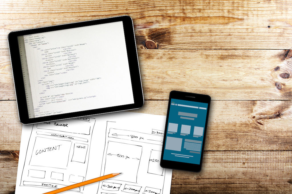
Mobile Design: 10 Years On
Today, many people use their smartphone as their sole computer. There are 3 billion people with smartphones, and 1.3 billion who own computers.
Mobile traffic increases year over year, says Pete Polgar, Chief Marketing Officer at Clikz Digital, a digital design and marketing agency based in Little Falls, New Jersey, and is poised to surpass desktop traffic.
“A phone is more versatile and provides more value to the end user than a computer,” he says. “You will see a massive increase in phone usage over the next few years as the technology gets cheaper.”
“People have phones on their person 90 percent of the time,” says Matt Felten, Lead UX Designer at DreamHost. “There’s a lot of people using a phone more than a laptop or desktop.”
If your website isn’t mobile-optimized, you’re missing out, says Polgar. He points out that Google will not rank your site highly if your website is not mobile-friendly. “If your users have a mobile bad experience, they are most likely not returning your website,” he adds.
Felten echoes that sentiment: “Mobile-first design is not going to hurt you. It will only help you.”
What Does Mobile Web Design Mean, Anyway?
Responsive design means that no matter how big a screen is — from a phone to a watch to a tablet to a desktop — the site will fill the screen and present information in a clear way, Felten says.
“It’s not like you’re getting a flyer made or a newsletter that’s printed and has a constant canvas size,” he says. “The proliferation of the iPhone means that designers have to adapt to variable screen sizes and come up with new methods for a plethora of different devices.”
Starting a Site From Scratch? Think Mobile-First
Bryan Clayton, CEO of GreenPal, spent nine months building his company’s site from scratch. “Right out of the gate, there were major problems,” he says. “We assumed that the majority of our users would shop for a lawn care service from their desktop or laptop computer. But it became very clear, very quickly that more people were accessing the website from their mobile phones and tablets than from a desktop or laptop computer — 4-to-1.”
The original full-featured desktop experience included all kinds of bells and whistles such as animations. “We had all kinds of other features that make a desktop experience delightful,” he recalls. “The problem with this approach was that the desktop experience would not translate to a mobile web browser.”
As a result, the website was bloated and didn’t work well on mobile. Users found that they had to pinch and zoom to get through the sign-up process.
Small businesses — even ones with a local clientele — need to be online. Here are six reasons why.
“Before our website was rebuilt for a mobile-first experience, conversion on a mobile browser was less than 4 percent,” he says. “That means that people who attempted to sign up abandoned in the process 96 percent of the time.”
After rebuilding the site to be mobile-first, Clayton found that 82 percent of people who initiated the sign-up process to get a free price estimate complete the entire process from their mobile device and tablet.
“Our mobile-first product is the only reason why we are even in the game today,” he says.
Hone In On Your Audience
Polgar finds that many clients still ask for desktop-based sites. But “a lot of these businesses did not analyze how their customers are finding them, which was on mobile,” he says.
For any website launch or redesign, he suggests business owners first figure out how the customer uses their site. Once you determine how they will use the site, then you can develop an appropriate strategy.
Additionally, make sure your site is accessible to all readers — from adjusting the contrast so colorblind people can read content to making it possible for visually impaired people to understand through screen readers.
Ask For Customer Feedback
Zondra Wilson, owner of Blu Skincare in Los Angeles, only found out that her site wasn’t mobile-friendly when she started asking for feedback from customers.
“I would ask my customers to write a review and they would say they couldn’t find where to write it,” she recalls. “I would ask them about my blog or articles that I posted and they had a hard time finding them. They had trouble viewing my site on their cell phones. They had to scroll down a lot before my first picture or any information about my company popped up. They didn’t know how to navigate through my site. Many were frustrated and didn’t go past the first page.”
Wilson recently upgraded her site to a more mobile-friendly version and has already noticed that users are viewing more pages on the site than usual.
Wondering if you have what it takes to start an online business? Here are 4 traits successful entrepreneurs have in common.
Think Small
Less is more when it comes to mobile. Since phones aren’t as powerful as a desktop browser, you should make sure your site is optimized to load quickly, and that your web host can handle the traffic, explains Polgar.
Ultimately, the best design strategy is simple: take away all excess clutter.
“You need to design for small,” says Felten. “You have to be a little more focused. You have to cut down on information and content.” After your mobile site is in place, you may find that you don’t need to add more to the desktop version to the site, after all.
“Small businesses will have to overhaul their current marketing strategies, as their screen real estate has shrunk significantly,” says Polgar.
Vitaliy Vinogradov, CEO of Modern Place Lighting, found that a switching to a mobile-first design led to 30 percent more conversions compared to desktop. “One important thing to do is to remove excess plugins, popups, or any other screen inhibitors on the mobile version of the site,” he says.
His team combed through the site and eliminated a few social sharing plugins that took up valuable real estate on the screen.
Refine Your Design Aesthetic
The rise of mobile has spurred the rise of design-centric companies like Apple and Google. Consumers today expect more sophisticated design, says Felten.
“There’s a big push to see the business cases of a beautiful and well-performing website,” he says. “If I’m a small-business owner and all of the competition has a really nice website and I don’t, in a less than a second, people make a negative judgment about my product.”
On the flip side, if you have a beautifully-designed site, people think that you value and put the same amount of care in your product.
Don’t forget to pay attention to typography. The right font can make or break your website’s conversion rate.
Create a Consistent User Experience
Before mobile-first design, people built a website meant to be viewed on a desktop and then designed a mobile version.
The problem?
Your desktop site might have an entirely different look and feel compared to its mobile site. For example, Gmail’s app on the phone is different from the mobile site and the desktop site. A simple, responsive design eliminates jarring differences in user experience, says Felten.
Think Social
The vast majority of blogs are being read and shared through social, says Felten.
Think about it: from cat photos to product reviews to memes, if anyone is sharing content they’ve read from a blog, it’s most likely going to be through a social platform. This is a case where you’d want to make sure you have a responsive design, Felten suggests.
Make social media work hard for your business. Here are 4 simple tricks.
Your business should have a social media presence across the appropriate platforms, so you can reach the maximum amount of people. “For some businesses, it makes sense to have a Facebook, and others require an Instagram,” he says. “This creates multiple entry points to your site and a way to showcase your full range of services.”
Do You Need An App For That?
The iPhone also introduced the concept of apps that companies can build for their customers. But does your company need one? Felten says you should make sure that your website is strictly informative.
If your company provides daily functions — like booking a service, checking a balance, or ordering a product, it may be best to create a companion app.
This DreamHost customer built an aviation app to take plane scheduling to — get ready for it — new heights.
What’s Next?
“Moving forward for any small business, you need to have a website and your need to have all your browsers be mobile-friendly,” says Felten. Beyond that, Polgar foresees that the cloud will become even more important, which means that companies will have to design around making your files are easily accessible using an internet connection.
The smartphone isn’t going anywhere — and neither is mobile. Set up your mobile-friendly WordPress site today!
—Reporting by Maridel Reyes
Source: DreamHost