Optimizing your 404 page is unlikely to top your list in terms of digital marketing priorities. However, it’s not something you should overlook or try to rush – especially if your site is frequently changing URLs.
404s (…or four zero fours if you’re in the military) are just another marketing tool – if made correctly.
What is a 404?
A 404 is the response code that should be provided by your web server when a user attempts to access a URL that no longer exists/never existed or has been moved without any form of redirection. At a HTTP level the code is also followed by the reason phrase of ‘Not Found’.
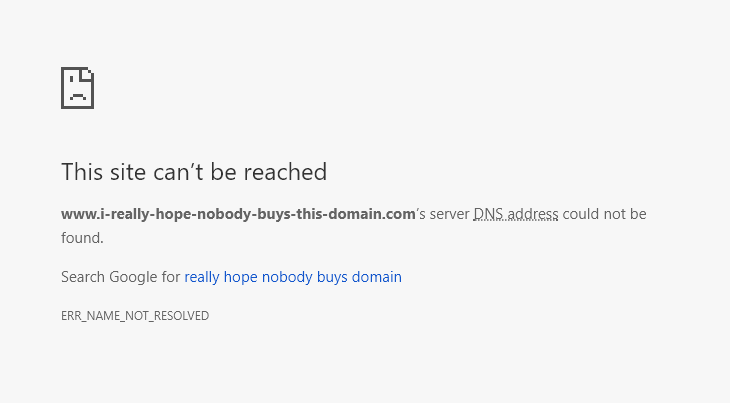
It’s important to realize that DNS errors are a totally different kettle of fish and occur when the domain has not been registered or where DNS has been misconfigured. There is no web server to provide a response – see below:
If you’re looking to pass time or have a penchant for intellectual self-harm you may enjoy this list of HTTP status codes, where you can discover the mysterious difference between a 301 and a 308…
Impact of 404s on SEO
We can’t all be blessed with the foresight to develop a well-structured and future-proof site architecture first time around. 404s will happen – whether it’s a new site being tweaked post-launch or a full-blown migration with URL changes, directory updates and a brand spanking new favicon! In themselves, 404s aren’t an issue so long as the content has in fact been removed/deleted without an adequate replacement page.
However, if a URL has links from an external site then you should always consider a redirect to the most appropriate page, both to maintain any equity being passed but also to ensure users who click the link aren’t immediately confronted with a potentially negative experience on your site.
What are soft 404s?
Soft 404s occur when a non-existent page returns a response code other than 404 (not found) or the lesser known 410 (gone). They also happen when redirects are put in place that aren’t relevant such as lazily sending users to the homepage or where there is a gross content mismatch from the requested URL and the resulting redirect. These are often confusing for both users and search engines, and are reported within Google Search Console.
Helping the user
Creating a custom 404 page has been all the rage for a number of years, as they can provide users with a smile, useful links or something quite fun (more on this later). Most importantly, it’s crucial that you ensure your site’s 404s aren’t the end of the road for your users. Below are some handy tips for how to improve your 404 page.
Consistent branding
Don’t make your 404 page an orphan in terms of design. Ensure you retain any branding so that users are not shocked into thinking they may be on the wrong site altogether.
Explanation
Make sure you provide users with some potential reasons as to why they are seeing the error page. Stating that the page ‘no longer exists’ etc can help users to understand that the lovely yellow raincoat they expected to find hasn’t actually been replaced by a browser-based Pacman game…
Useful links
You should know which are the most popular pages or directories on your site. Ensure your 404 page includes obvious links to these above the fold so that (coupled with a fast site) users will find the disruption to their journey to be minimal.
Search
There’s a strong chance that a user landing on a 404 page will know why they were on your site; whether for jeans, graphic design or HR software, their intent is likely set. Providing them with a quick search box may enable them to get back on track – this can be useful if you offer a very wide range of services that can’t be covered in a few links.
Reporting
Providing users with the ability to report the inconvenience can be a great way for you to action 404s immediately, especially if the button can be linked to the most common next step in a user’s journey. For example: “Report this page and get back to the shop!”
Turn it into a positive
Providing a free giveaway of a downloadable asset (by way of an apology) is a great way to turn an otherwise-disgruntled user into a lead. By providing a clear CTA and small amount of data capture, you can help to chip away at those inbound marketing goals!
Reporting 404s in Google Analytics
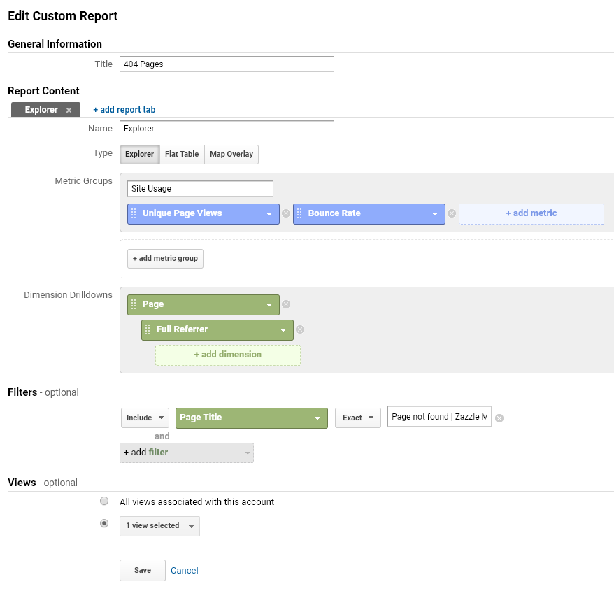
Reporting on 404s in Google Analytics couldn’t be easier. While in many cases your CMS will have plugins and modules that provide this service, GA can do it without much bother. The only thing you’ll need is the page title from your 404 page. In the case of Zazzle this is ‘Page not found | Zazzle Media’.
The screenshot below contains all the information needed. Simply navigate to Customization > Custom Reports > Add New within your GA console.
Title: The name of the custom report
Name: Tabs within the report (you only need one in this case)
Type: Set to Explorer
Metric Groups: Enter ‘Site Usage’ and add in Unique Page Views (to track occurrences per page) and Bounce Rate (to measure how effective your custom 404 page is).
Dimension Drilldowns: Page > Full Referrer (to track where the visit came from if external)
Filters: Include > Page Title > Exact > (your 404 page title)
Views: Select whichever views you want this on (default to all if you’re unsure)
Save and return to Customization > Custom Reports, then click the report you just made. You’ll be presented with a list of pages that match your specified criteria. Simply alter your data range to suit and then export and start mapping any redirects required.
You may wish to use Google Search Console for reporting on 404s too. These can be found under Crawl > Crawl Errors. It’s always worth running these URLs through a tool such as Screaming Frog or Sitebulb to confirm that the live URL is still producing a 404. Exporting these errors is limited to ~1000 URLs; as such, you’ll need to Export > Mark as Fixed > Wait 24hrs > Repeat.
Making a fun 404 page
Some of the best 404 pages throw caution to the wind, ignore best practice and either leverage their brand/character to comical effect or simply go all out and create something fun and interactive. Let’s face it, there is no better way to turn a bad situation (or Monday morning) into something positive than with a quick game of Space Invaders!
The below examples are just a few popular brands that have a great ‘404 game’.
Lego
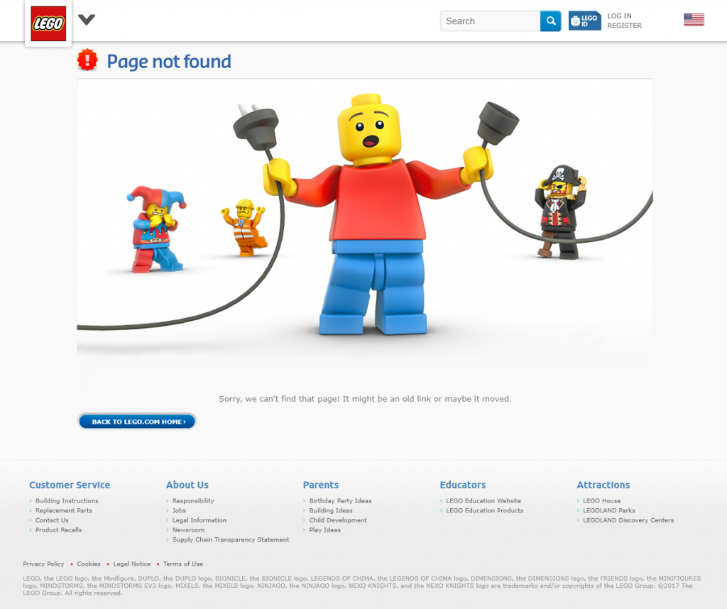
It was always going to be on the cards that Lego would have something quirky up their tiny plastic sleeves, and while the page lacks ongoing links it provides a clear visual representation of the disconnect between the content you expected and what you’re getting.
Kualo
Behind every great website, there’s a great host. Kualo have taken their very cost-focused industry and made a fun and interactive game for users who happen across a 404 page.
Bit.ly
If there’s one site that has its URLs copy and pasted more than any other (and often incorrectly) it’s bit.ly. With over 1.2 billion backlinks from over 1.8 million referring domains I reckon there will be a few 404s…don’t you?
Blizzard
Ding! I’ve naturally lost count of how many times it’s given ‘Grats’ – Blizzard’s quirky 404 gives tribute to the commonly-uttered phrase seen in chat boxes across all their games.
Github
It only seems fitting that one of the geekiest corners of the internet be served with an equally geeky 404 page. Github’s page is unique because there is actually a dedicated URL for this design which has over 520 referring domains itself! Not to mention their server error page is equally as cool.
Summary
Hopefully the information detailed in this article has provided you with a great strategy to leverage your 404 page as a content marketing asset or simply to improve the experience for your user. We’d love to see any creative 404 pages you come up with.
Related reading
If you're new to the business of SEO and are just figuring out how to optimize your WordPress site for search, navigating the landscape of SEO can seem like a nightmare. Here are 10 challenges to watch out for, and how you can solve them.
When choosing an ecommerce platform to power your online store, it's important to consider search engine optimization (SEO) features in your decision-making process. Let's take a look at five core features that your ecommerce platform needs to have, along with examples of platforms that offer each feature.
As a society, we have been conditioned with the age-old saying “Build it and they shall come”. However, does this hold true for the digital world and your website? And more specifically, what about Google?
SEO and performance marketing agency BrightEdge today released a new report which sheds light on the steadily widening gap between mobile and desktop search. I spoke to Erik Newton, VP of Customer Marketing and Head of SEO at BrightEdge, about the report’s findings, Google’s mobile-first index tests, and how SEOs can adapt their strategy.
Source: Search Engine Watch


