Imagine a website — any website. What do you picture first?
You’re imagining the site’s header, color scheme, and overall design, right? Yep, there was a correct answer to that rhetorical question.
That’s the reason many (if not most) web designers focus on making sure the top part of the page’s design is attractive, attention-grabbing, and intuitive from an end user’s perspective. But the footer — your website’s caboose — can be just as important to the success of your site as those eye-catching elements at the top.
Simply put, a website footer is the section of a website that lives at the bottom of each web page. This section is often laid out like the index at the back of a textbook, containing links to articles or resources, contact information, and more.
Whether you are creating your own website or simply surfing the web in search of answers, it’s important to learn the significance of website footers and how they can work to their fullest potential. So important, in fact, that we’ll start by proving it to you.
So Why Are Footers Important?
Aside from providing a visual conclusion to your web page, website footers are important on two primary fronts.
For the End User
Footers provide important information to the site’s visitor that may not be visible or easy to find in the main menu — like contact info, the “About Us” page, terms of service, or press releases.
For Site Owners
From the business-owner perspective, a footer can offer a platform on which to advertise and promote events, deals, popular articles, and social media accounts. Offering useful footer resources and tools for the visitor’s experience builds trust and respect and, in turn, can create followers and regular users.
They Get Viewed More Than You’d Think
A Chartbeat study found that 66 percent of engaged time on a web page happens below the fold — the part of the website that isn’t visible when it first loads. That means that most of your visitors are spending more time with content that they have to scroll down to find than with those flashy headers we talked about earlier.
In fact, many users start scrolling even before the site had finished loading, which results in the top of the page having a 20 percent lower view rate than farther down.
And They Can Increase Conversions
We’ve already highlighted how font choices can affect conversions on your website, but did you know that your footer can too?
Some brands have seen as much as a 50 percent uptick in conversions when they optimized their footers for user experience. Smart Insights noticed a nearly 16 percent increase in revenue per customer when they tested a fleshed-out footer — with products sorted into easy-to-navigate categories — over a less-intuitive option.
Remember that the website footer is often the last thing a visitor looks at before leaving the page. Make sure you give them the information they need to stay and convert, whether that means signing up for your email list or purchasing a product. A footer can make the difference between a sale and a bounce.
3 Keys to Good Footer Design
Now that we’ve established why footers are so darn important, let’s take a look, in more detail, at what parts make up a footer and how you can savvily design one for your own site.
1. Visual Appeal
Sad fact: people do judge books by their covers. With that little nugget of human psychology in mind, it’s important to include some visual elements in the footer, because the way it looks will be the first thing a user notices. Whether you choose buttons, a logo, illustrations, or even a colored pattern, having something visual at the bottom of a page to please the visitor’s eye is important.
The secret to a well-designed website? Use the Force (and learn these 10 design lessons from StarWars.com).
2. Brand Focus
A footer needs to be consistent with your brand aesthetic — from the color scheme to the graphics and typography. For instance, if there is a logo in the header of a page, it may be appropriate to repeat it in the footer.
3. Cleanliness
Keeping a footer clean is a forgotten art on the internet. Too many times, you’ll be reading an article or blog on a website only to scroll down to find a jumble of unorganized links in the footer. As an end user, this can be jarring and overwhelming. Thoughtfully curating the right content and making sure the font is visually pleasing is super important.
10 Common Content Elements to Include in a Footer
Once you’ve hooked users with a great design, the next step is to optimize your footer’s content. Adios, jumbled links! Here are 10 common content elements to consider adding to the bottom of your website.
1. Copyright
This might seem obvious, but having a year and the copyright symbol is easy protection against plagiarism. To learn more about how to avoid copyright infringement, check out our guide on the Digital Millennium Copyright Act (DMCA).
2. Sitemap
This probably won’t get clicked on by a ton of visitors, but an HTML version of a sitemap is useful for search engines like Google to find and index pages on the site.
3. Privacy Policy
A privacy policy link in the footer can document to users what information your website collects, how it is stored, and how it may be utilized.
4. Terms of Use
A Terms of Service link in a website footer will typically take visitors to a legal disclosure that explains what users are agreeing to by using your service or product. Here’s how DreamHost’s Terms of Service are formatted.
5. Contact Information
Philosophical question: if a visitor can’t find your contact information on your website, did the visit really happen? It’s so important to make it easy for your visitors to continue engaging with your brand. After all, they’ve made it all the way to the bottom of your page! So throw them a bone and make sure you’ve got a “Contact Us” link or a submission form, at minimum, in your footer. Then make it is easy to find your brick-and-mortar address, primary phone numbers, and links to web support.
6. Navigation
The footer is your last point to redirect a lost visitor. If they haven’t found what they’re looking for above the fold, a navigation section at the bottom can point them to the subject they were initially interested in or care to explore further. But please don’t paste your entire sitemap into the footer. Too many websites do this, which results in an oversaturation of options and links. Instead, the links you include should be paired down and neatly categorized so it’s easy for readers to find FAQs, support info, or specific products.
7. Social Icons
Having social icons — those little illustrated links to your Twitter, Facebook, Instagram, and LinkedIn accounts — is an absolute must! Orbit Media surveyed more than 50 marketing websites and found that 72 percent touted their social creds at the bottom of the page. No footer should be without these icons.
8. Email Signup
Having an area where visitors are able to subscribe to your mailing list or newsletter is a great way to build brand loyalty. Implementing an email form can be as easy as using a WordPress plugin or you can use parter with an email services provider like MailChimp.
9. Image Gallery
An image gallery in the footer can be a great way to entice customers. Showcasing snaps of your company events or adding company-relevant illustrations can engage brand enthusiasts and apathetic web surfers alike.
10. Mission Statement
Including a link to your company’s “About” page can have a strong impact on people who visit your site. An interesting mission statement, or even a couple of clever lines to match your company’s personality, can truly leave a positive impression on viewers and compel them to return to your website in the future.
But You Don’t Need to Include All of These
One thing to remember: all these elements do not necessarily need to exist in a single footer at once. Let’s be honest, that would be a lot to take in. It’s up to you, website owner, to decide which links should live in your site’s footer. Use these 10 elements as a guide as you think about what your visitors are most likely to need and use.
Regardless of what links you include, follow these 20 tips to make your website footer accessible for all visitors.
3 Ways to Upgrade Your Current Footer
Now that you know what goes into a website footer and why those elements are important, let’s explore three key things you can do to upgrade your current footer fast.
1. Contact Forms
As we mentioned above, having contact information in your footer is crucial, but it’s not a great idea to just leave your email address hanging out in the open. Spam happens to good people. Using a contact form can help in a myriad of ways.
- Form submissions are easy to track in Google Analytics, making it useful for website marketing.
- An end user might be on a public computer and may not be able to use their private email.
- Completing a contact form sends users to landing pages that can provide more useful information and resources.
- Form submissions can be saved into a database in the event that the email doesn’t get sent properly.
- Last but not least, you can skip getting a bunch of phishing emails, spam, and other scams.
2. Sticky Footers
Sticky footers do a reverse magic trick; they never disappear! Regardless of where the user scrolls on a page, the footer will follow. This can be very useful if your website has a clean, modest footer or if you want to promote just one part of your footer (like an email newsletter signup with a call-to-action button) and save the rest of your links for the bottom of the page.
3. Focus On Your User, Not Keywords
What you’ve heard is true: optimizing your website for search engines can boost traffic. But when it comes to footers, restraint is the name of the game. Google’s search algorithm doesn’t dedicate much attention to keywords in footers, and over-optimization can actually hurt your website.
Optimization can be overwhelming, so start with these 5 no-brainer tips for SEO newbies.
Great Footer Examples in the Wild
If a picture is worth a thousand words, then these footer examples, culled from sites across the web, will nearly quintuple the word count of this blog post. You’re welcome! Jokes aside, they’ll provide inspiration as you work to trick-out your website’s footer.
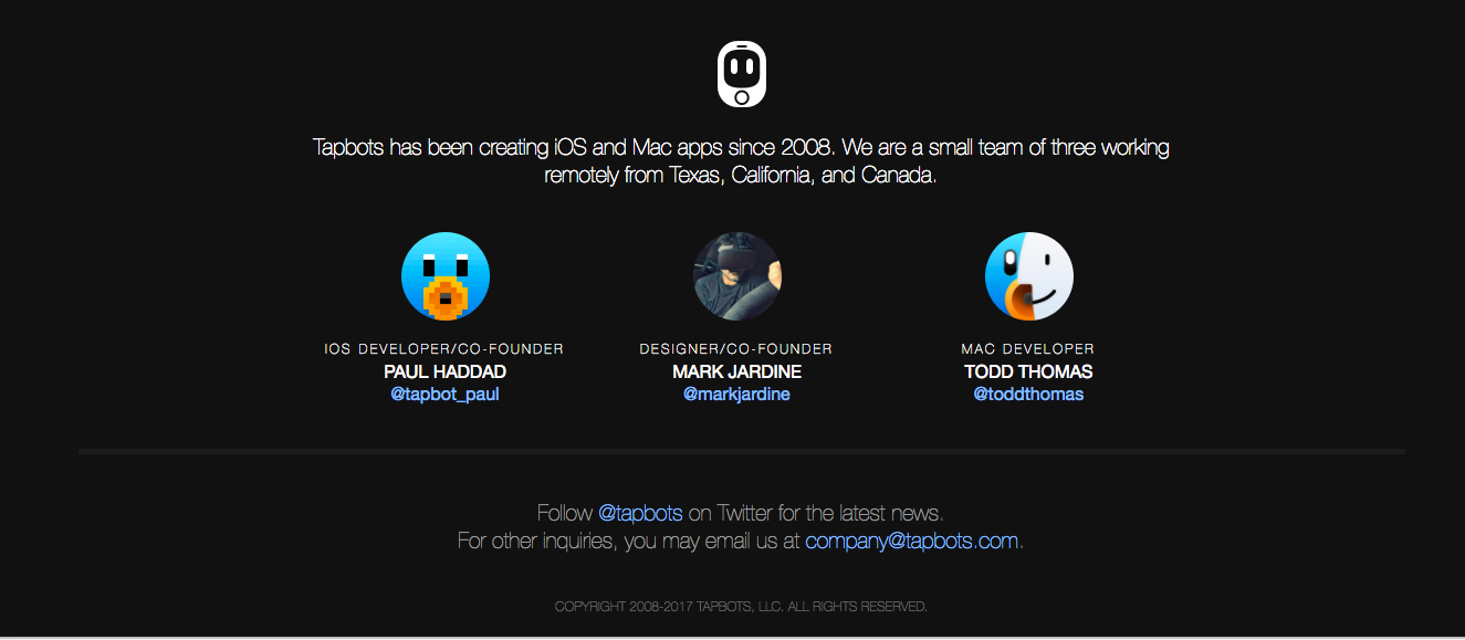
1. Tapbots
Tapbots creates utility robots for Apple mobile and desktop products. On the site’s footer, there are wide, easy-to-navigate support, contact, feedback and company news sections. Below those sections, there are eye-grabbing illustrations, each accompanied by the name and social media handles of the individuals behind Tapbots. The footer is informative, has a nice layout, and, interestingly, makes up the lower third of the web page.
2. Mom & Popcorn
Designed in a funky, ’50s style, Mom & Popcorn’s website has a gorgeous footer full of featured popcorn products as well as a field to sign up for the company’s mailing list and links to additional information. This footer is clean, lively, and perfectly matches the brand’s overall aesthetic.

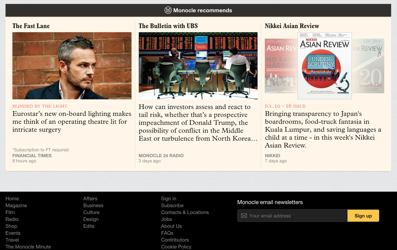
3. Monocle
Monocle’s footer helps readers better navigate the website’s article archive. With three columns dedicated areas of interest as well as an obvious (and appealing) way to sign up for the mailing list, secondary navigation is the name of the Monocle’s game. 
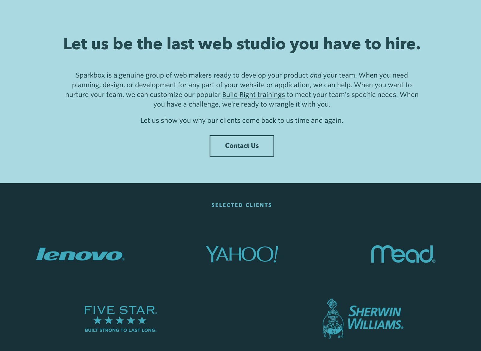
4. Sparkbox
Simplicity is key with Sparkbox. The company builds websites and web applications for small businesses, and their footer reflects the brand’s sleek and professional aesthetic. At the bottom of the website, their tagline — “Let us be the last web studio you have to hire” — is followed by a strong CTA and an enticing “Contact Us” button. Below that there are several top-tier clients and links to learn more about the company.

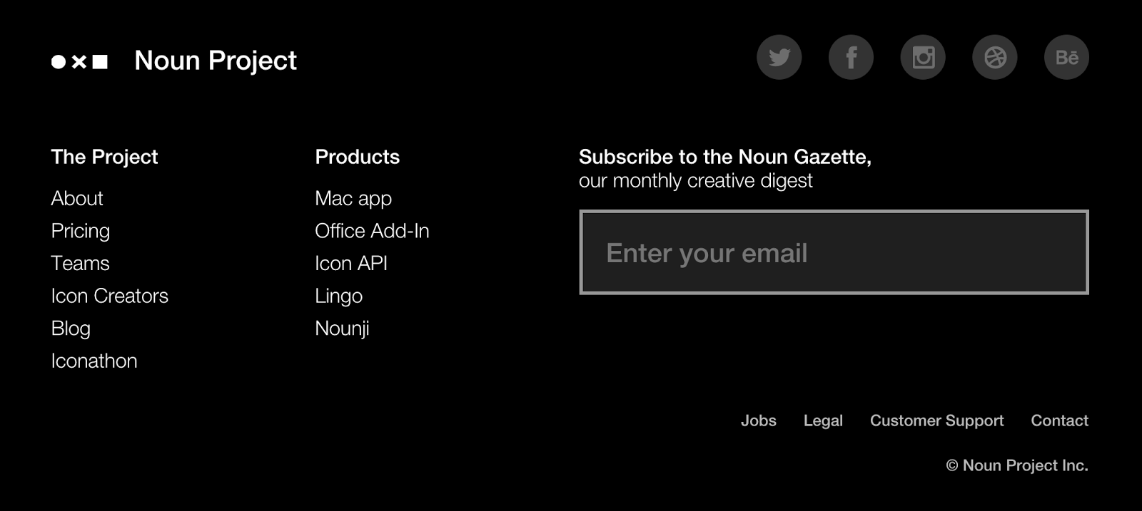
5. Noun Project
The Noun Project offers a wide array of visual icons to help brands communicate creatively online. And the site’s clean footer coordinates with the paired-back look of most internet icons. This footer balancers the user’s needs perfectly with the site’s goals. 
Getting to the Bottom of Website Footers
You’ve made it. You’re all the way down here at the edge of the article. So we’ll reward you with a peek at our footer (see it down there?). Now show us yours — or at least tell us about it! We want to know what tricks you’ve employed to help your footer convert better. Have you had good luck with a specific form, tool, or widget? Share in the comments below!
Creating great footers has never been easier thanks to DreamHost’s very own site builder, Remixer. Get started for free!
— Reporting by Louis Beaudreau
Source: DreamHost